

Now more than ever, we all want to visit grocery stores and other essential businesses when they’re not crowded. Before the pandemic, this information helped us to save time and avoid lines. Now, knowing how busy a place is adds an extra layer of safety and comfort.
With a few taps on your phone or clicks on the keyboard, Google Maps shows how busy stores, restaurants, parks or shopping centers tend to be at any given time. It works off the location data history gathered by people’s phones, then calculates when a place is usually the most and least busy each day of the week.
Most of us are familiar with this feature; if you Google any particular business it tends to automatically come up. This same concept can now be applied at your office using InnerSpace’s indoor location platform, making it easy for employees to see just how busy their workplace is at any given time of day.
Bringing “popular times” into the office
For businesses that will seize the new flex work trends and redesign offices accordingly for a smaller in-person workforce on any particular day, the ability for employees to see how busy it will be takes on considerable value.
The “popular times” metric becomes an empowering tool for employees to be as productive as possible while making the best decisions for themselves. The same way someone might choose the right time to hit the supermarket is akin to them planning when to visit the office, choosing where in the office they want to work, and booking the rooms they need.
With InnerSpace, an employee who needs to visit the downtown office, for example, can choose the days they’d prefer based on predicted occupancy levels. Once there they can find the best place to work for their individual preferences and workstyle needs. Using this data makes the office truly flexible for employees.
A quick scenario to demonstrate:
- Cassandra wants to work in the office tomorrow. She checks to see how busy it’s projected to be. The Popular Times metric predicts 32% occupancy – quite reasonable and within her personal comfort range. But in the morning she’s delayed a few hours. She checks the data again and sees the office is now at 72% occupancy, busier than she’d hoped. Cassandra chooses to delay her visit to the next day. Cassandra feels safe, and is glad she is empowered to make the best decisions for her own health and safety.
- Robert is fully vaccinated and excited to see his colleagues. He is encouraged to see the office at 72% capacity. It means he’ll be able to catch up with people and expects to see many of his colleagues at his planned brainstorm session in person. At the office, Robert wants to work in a hotdesking area in the morning and then a collaboration zone in the afternoon where the brainstorm can be informal. With InnerSpace, Robert sees there are 4 seats in the hotdesking area on the 7th floor available. He also sees that the collaboration zones are available at 1:00. He assesses the features and capacity of the space he needs, and books the space that’s best for the group.
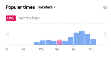
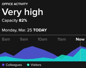
Google Popular Times Graph (Left), InnerSpace Office Activity Metric (Right)
In this way, we can enable employees to predict and plan when and how to use the office, and make real-time choices in the moment to find available workspaces, book rooms, access resources and connect with colleagues.
This ability is made possible through quantitative data that empowers employees, ensures their safety, boosts their productivity, and creates a better workplace experience. The duality of the data – a) what the information tells you; b) what actions are then informed by it – is vital in ensuring workplaces are designed to function as efficiently as possible while giving staff new levels of independence.
Making the leap from something as ubiquitous as Google’s “Popular Times” to InnerSpace’s platform is seamless and simple. Contact us to find out more.